I'll take note of that thanks, I always used the 'sausage and ball' method for arms, torso, legs etc.Lai wrote:
Hmmm,.. I don't mean to offend you, but you still seem to have quite a problem with bodies as well. You're poses are good indeed and your textile folds and overall clothing and accesoires are very good too. However, the figure that wear them and do the poses seem to lack the anatomy. What I mean is that if your characters would play a game of stripoker, they would look like they were made out of ice-lolly handles.M.O.A.B wrote:
Always had trouble with faces, used to be bodies as well but I'm starting to get the hang of poses now, starting to work more on the faces.
The human aspect doesn't seem to be in league with the rest. If you improve that, then apply the rest of your clothing- and posedrawing skills, your drawing will be I suggest you start drawing some characters naked, preferably bold as well. Then use that as a skeleton, add hair and then the clothing. You could do the skeleton model with pencil and the rest with ink; if you then erase the pencil you can see clearly how it turned out. I won't look very sexy, but it's good practise. Watch a lot, people in class, people in the train, etc., always keep watching. Start with women; their shapes are more pronounced which makes female anatomy a lot easier.
Trying to help here. I can't do clothing the way you do and I need to improve a lot of things as well. For one, I have to work on my noses!

Scanner still takes away some of the shaded parts so this doesn't look as good, and increasing the dpi seems to sgive it the stipple effect, need to wait for ps I guess. But I reckon I'm finally managed ot get a face right
Last edited by M.O.A.B (2008-05-19 14:20:31)
Wow. Good JobIcleos wrote:
Here are some pieces from my collection.
http://photos-h.ak.facebook.com/photos- … 5_1482.jpg
http://photos-b.ak.facebook.com/photos- … 3_3711.jpg
http://photos-f.ak.facebook.com/photos- … 3_8583.jpg
http://photos-b.ak.facebook.com/photos- … 7_2772.jpg
http://photos-f.ak.facebook.com/photos- … 3_4380.jpg
http://photos-h.ak.facebook.com/photos- … 5_5728.jpg
http://img.photobucket.com/albums/v330/ … eburst.png
http://photos-h.ak.facebook.com/photos- … 143_88.jpg
http://photos-e.ak.facebook.com/photos- … 0_8547.jpg
http://photos-f.ak.facebook.com/photos- … 5_6113.jpg
http://a620.ac-images.myspacecdn.com/im … 228b03.png
http://a917.ac-images.myspacecdn.com/im … 6f0ef4.png
As far as I know, scan-software usually has an 'advanced option' which allows you to adjust the colour sensitivity (not the DPI). If that doesn't work you could try scanning in pure B&W rather than grayscale. If you do so, the scanner will either identify an individual pixel as either black or white rather than a tone of black and white. It will give your drawings a bit of an overlighted effect which can either suck very hard or turn out rather nice. It is very sensitive to impurities though, as can be seen on the example below as the scanner has picked up some of the wrinkles of the paper, particularly at her right arm. You need a really good scanner and keep the paper very straight for good scans. In any case there are just limitations to what you can produce by scanning in hand-made drawnings,.. which is why I bought myself a cheap-ass pen tablet.M.O.A.B wrote:
Scanner still takes away some of the shaded parts so this doesn't look as good, and increasing the dpi seems to give it the stipple effect, need to wait for ps I guess. But I reckon I'm finally managed ot get a face right
The example below I actually made a few months ago early in the morning after I suddenly woke up from a dream and felt I had to put it on paper. Her face (and yes, her nose again) are very bad, but it wasn't about her facial features anyway. From left to right: colour, grayscale (often called B&W) and B&W (the real deal).

Last edited by Lai (2008-05-20 02:10:54)

Gave a bit of tampering, this was best result I coudl come up with for the time being.
Drawing is of the same character I put above, slightly different appearence though.
It looks very,.. crayonish. Do you use a retouche pencil for shading? What kind of pencil do you use anyway and what kind of paper?
Graphite pencil an sketch paper, it looks different to this in real life, non of the stippling.Lai wrote:
It looks very,.. crayonish. Do you use a retouche pencil for shading? What kind of pencil do you use anyway and what kind of paper?
Hmmm,.. I'm pretty sure the stippling is caused by the sketch paper. If you want to get rid of it, try using standard A4 printing paper and don't use a pencil softer than 2B or even HB. Beware though, printing paper wrinkles easily especially if you're into using an eraser.M.O.A.B wrote:
Graphite pencil an sketch paper, it looks different to this in real life, non of the stippling.Lai wrote:
It looks very,.. crayonish. Do you use a retouche pencil for shading? What kind of pencil do you use anyway and what kind of paper?
Printed off one of em and tried colouring it, mix of pen and pencil, never was very good at colouring like.


/hide

drew this one on printer paper, seems to have less of the stippling effect, same character.
Apart from the reduced stippling, I think it's much better in general. I guess it's because less grainy paper makes shading easier.M.O.A.B wrote:
http://img509.imageshack.us/img509/6392/natl2cv5.jpg
drew this one on printer paper, seems to have less of the stippling effect, same character.
By the way, now I look at the character for at least the fifth time, I finally know what her face is missing: cheekbones! Her face is too gaunt directly below the eyes. Try narrowing her chin a little and widen her cheeks and see how that turns out.
Got them, well cheekbone definition, just unfortunately scanner doesnt pick em up lol, too faint, reckoned that if i defined too much might not look right.Lai wrote:
Apart from the reduced stippling, I think it's much better in general. I guess it's because less grainy paper makes shading easier.M.O.A.B wrote:
http://img509.imageshack.us/img509/6392/natl2cv5.jpg
drew this one on printer paper, seems to have less of the stippling effect, same character.
By the way, now I look at the character for at least the fifth time, I finally know what her face is missing: cheekbones! Her face is too gaunt directly below the eyes. Try narrowing her chin a little and widen her cheeks and see how that turns out.

tried a different angle, some shading was lost around the cheeks like.
Whoooooaaaahhhhh,... major improvement in ridiciously small timespan. Have you uploaded some new drawning skills Matrix style or,.. ?M.O.A.B wrote:
http://img396.imageshack.us/img396/8223/loilookse6.jpg
tried a different angle, some shading was lost around the cheeks like.
She does need a nosejob tbh, or perhaps just a bit more shading. The angle of the nose seems to be right corner top down, while the overall approach seems to be right corner bottom up. If you've fixed that I suggest you step away from the pencil and work it out in harder lines and coloured shading. This might be a good point for you to consider buying a pen tablet. Cheap models from Wacom start at around 45 euro's, are of very decent quality and can do everything you'll need.
+1 for this one, by the way.
Got a pen tablet, just haven't used it for agesLai wrote:
Whoooooaaaahhhhh,... major improvement in ridiciously small timespan. Have you uploaded some new drawning skills Matrix style or,.. ?M.O.A.B wrote:
http://img396.imageshack.us/img396/8223/loilookse6.jpg
tried a different angle, some shading was lost around the cheeks like.
She does need a nosejob tbh, or perhaps just a bit more shading. The angle of the nose seems to be right corner top down, while the overall approach seems to be right corner bottom up. If you've fixed that I suggest you step away from the pencil and work it out in harder lines and coloured shading. This might be a good point for you to consider buying a pen tablet. Cheap models from Wacom start at around 45 euro's, are of very decent quality and can do everything you'll need.
+1 for this one, by the way.
My friend's girlfriend's drawing's.
Thoughts etc very welcome to pass on to her
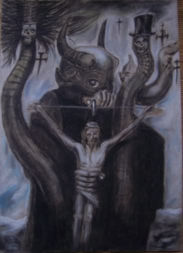
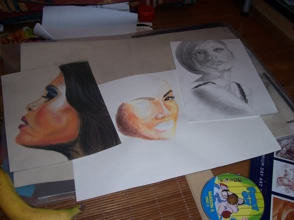
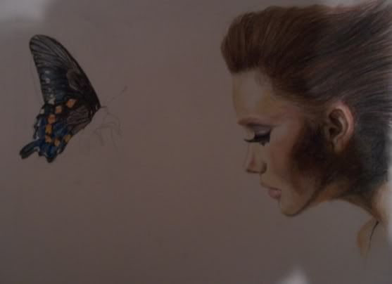
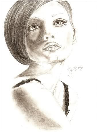
Thoughts etc very welcome to pass on to her


I find the first one quite,.. disturbing I guess.White-Fusion wrote:
My friend's girlfriend's drawing's.
Thoughts etc very welcome to pass on to her
http://i93.photobucket.com/albums/l70/W … 49840o.jpg
This one is simply brilliant. The shading is much better than on the last one, also some of the details are to 'strict' on that one (e.g. eyelashes and hairline). Evidently she should finish the butterfly If she finishes it, it would be nice to see her add some motion to the butterfly, actually make it seem as if the flapping of it's wings are causing the wind through lady's hair. 'Butterfly effect', potentially major artistic statement to be made with this one.White-Fusion wrote:
My friend's girlfriend's drawing's.
Thoughts etc very welcome to pass on to her
http://i93.photobucket.com/albums/l70/W … 74189o.jpg
Overall her style seems to be very real (as opposed to nice or cute). I'd like to see some more complete figures too.
What is she using by the way, watercolour?

trying a dab at cars, next ill try a bike providing i find the right shot of one that im after

ta-daa
Holy crap! Nice detail on the motorcycle.


Last edited by M.O.A.B (2008-05-30 08:17:49)
Try one of these next


