He used Adobe Photoshop CS2 Windows.Ridir wrote:
what program are you using and what are you doing to get the spilled paint effect? i'm a photoshop (cs2) newbieSarrk wrote:
Heres something I did in like, 5 minutes, Ive been messing around with poster grunge.
http://i36.photobucket.com/albums/e17/Sarrk/NICe.jpg


Thanks again.Warlord wrote:
BTW ~ Daphne is one of your best and I'm sure she is proud of your work.mcminty wrote:
Thanks.
Mcminty.
~ W
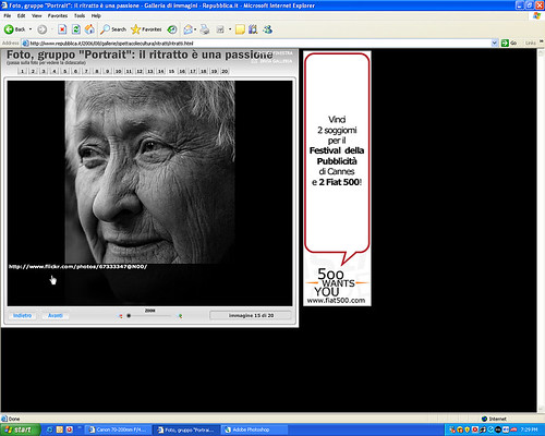
It's interesting that you mention that photo. It sort of a long winded story, but here goes...
I submitted that photo to the Flickr Gorup: Portrait. There's something like 250,000 photo's in the group. A user was getting 40 photos on behalf of www.repubblica.it, an italian newspaper, for a feature of the group on their website. Many users submitted their own photos but the guy also chose photos that he found to be excellent. The 40 photos were given to the staff at Repubblica, who then chose the best 20.
I was browsing the Portrait group discussion when I can across the thread that was talking about the Repubblica gallery, and how it was now up. I thought to have a look and see what they considered good portrait photography when I came across...

Oh yeah!
Mcminty.
Nice stuff McMinty. I like it.
Yeah thread was last used 8 months ago, but I don't want to make a seperate thread that would be closed


Nice job. I prefer this one over the US guy you posted 8 months ago. His arms were a bit shortM.O.A.B wrote:
Yeah thread was last used 8 months ago, but I don't want to make a seperate thread that would be closed
http://img261.imageshack.us/img261/4268/mjrye3.jpg
This one's also a lot more expressive.
The idea of any hi-fi system is to reproduce the source material as faithfully as possible, and to deliberately add distortion to everything you hear (due to amplifier deficiencies) because it sounds 'nice' is simply not high fidelity. If that is what you want to hear then there is no problem with that, but by adding so much additional material (by way of harmonics and intermodulation) you have a tailored sound system, not a hi-fi. - Rod Elliot, ESP
danke drew it in bed last night via torchlight lol, yep college nights are boringFreezer7Pro wrote:
Nice job. I prefer this one over the US guy you posted 8 months ago. His arms were a bit shortM.O.A.B wrote:
Yeah thread was last used 8 months ago, but I don't want to make a seperate thread that would be closed
http://img261.imageshack.us/img261/4268/mjrye3.jpg
This one's also a lot more expressive.
lol got a pic but i cant post it! How can i post a pic?
edit: think i got it....
http://img99.imageshack.us/my.php?image=foto0086dh0.jpg
made this while a project at school where we had to "copy" an artist - i chose mark rothko...
this pic is made with acryl - 120 x 200 (cm) in size...
edit: think i got it....
http://img99.imageshack.us/my.php?image=foto0086dh0.jpg
made this while a project at school where we had to "copy" an artist - i chose mark rothko...
this pic is made with acryl - 120 x 200 (cm) in size...
Last edited by GroeFaZErdi (2008-01-10 14:10:51)

in soviet russia, we look like this.
@ moab, nice traditional art, i like the shading.
@ ebug, i like the contrasting colors.
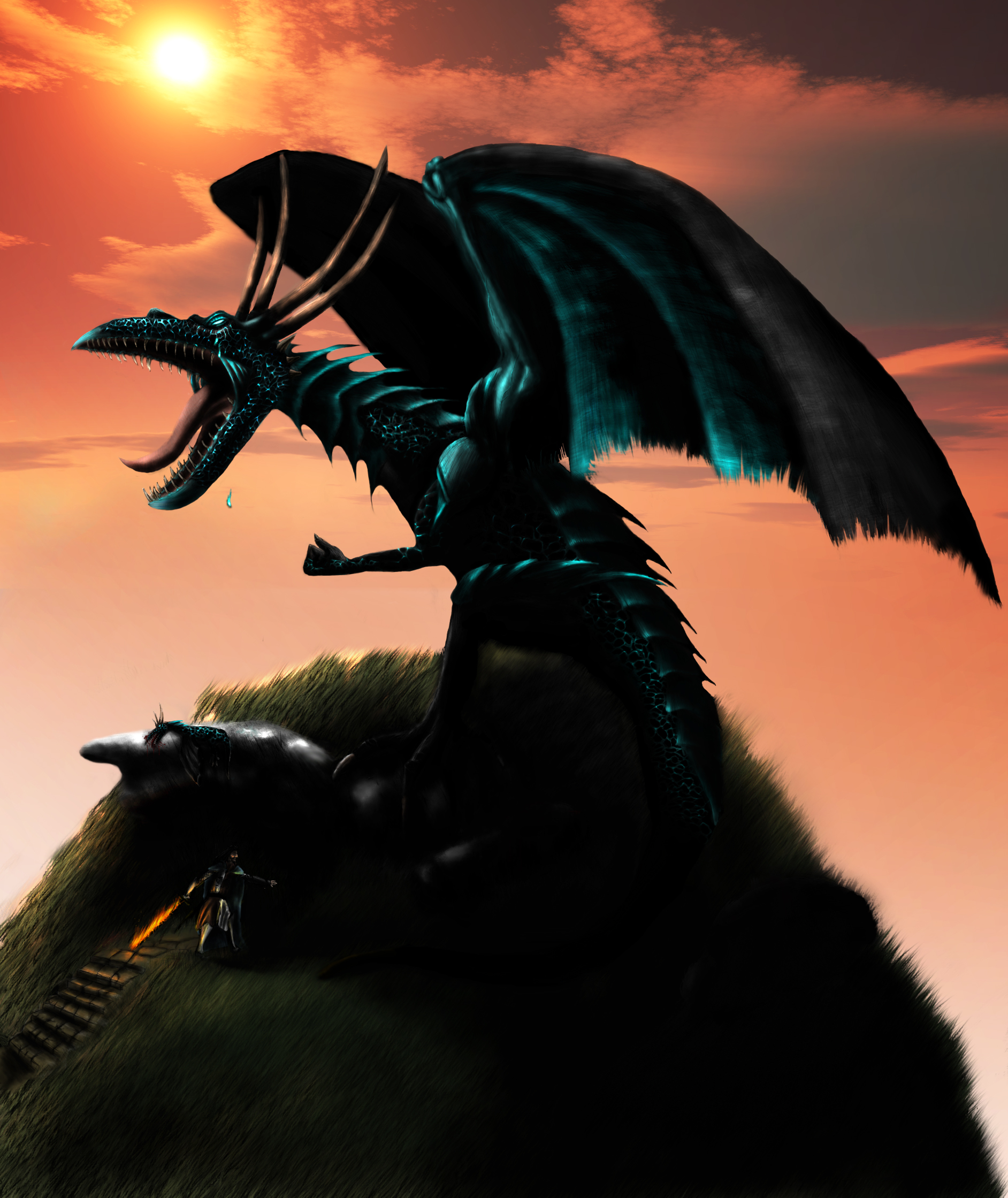
Heres a digital painting i just finished, right click>view image and zoom for full size.

@ ebug, i like the contrasting colors.
Heres a digital painting i just finished, right click>view image and zoom for full size.

Last edited by dont_be_ss (2008-03-04 15:39:30)
Here's an updated version of the sketch a few posts up,
shading and extras added . Nice work thar above me though.

shading and extras added . Nice work thar above me though.

MOAB's art is impressive. tbh.
Woah.dont_be_ss wrote:
@ moab, nice traditional art, i like the shading.
@ ebug, i like the contrasting colors.
Heres a digital painting i just finished, right click>view image and zoom for full size.
http://fc05.deviantart.com/fs29/f/2008/ … iBBiEZ.jpg
Nais.M.O.A.B wrote:
Here's an updated version of the sketch a few posts up,
shading and extras added . Nice work thar above me though.
http://img408.imageshack.us/img408/1313/mjrmundojm8.jpg
The idea of any hi-fi system is to reproduce the source material as faithfully as possible, and to deliberately add distortion to everything you hear (due to amplifier deficiencies) because it sounds 'nice' is simply not high fidelity. If that is what you want to hear then there is no problem with that, but by adding so much additional material (by way of harmonics and intermodulation) you have a tailored sound system, not a hi-fi. - Rod Elliot, ESP

Last edited by M.O.A.B (2008-03-06 14:25:44)
LoL Gaz i am jealous of your art. i wish i was good at art
But as for you thought of entering it for galleries or competitions?
But as for you thought of entering it for galleries or competitions?
Nice drawing MOAB man.
Ill post mine eventually.. (this weekend probably)
I did win a contest to design an oil rig in primary school once lol.robcr9 wrote:
LoL Gaz i am jealous of your art. i wish i was good at art
But as for you thought of entering it for galleries or competitions?
Dunno about competitions though. Drawings themselves are actually characters from my books .
I suck at drawing with pencils and pens/etc on paper .
nice drawing M.O.A.B, one tip work on the length and width of the face, along with the chin maybe do some pictures of just the face? just a suggestion
I got this one I did a while back, its on first page of this thread,Death_Brinded_Pro wrote:
nice drawing M.O.A.B, one tip work on the length and width of the face, along with the chin maybe do some pictures of just the face? just a suggestion

if i had a picture id done for my art GCSE id post it but atm i dont its on my other pc, im on laptop
but the picture above, it just looks like the features you need to work on, such as the lower half of face... for example; the chin, the mouth, any curves in the facial features and that sort of thing, but the face is the third hardest thing to get perfect, coming after feet and hands of course
but the picture above, it just looks like the features you need to work on, such as the lower half of face... for example; the chin, the mouth, any curves in the facial features and that sort of thing, but the face is the third hardest thing to get perfect, coming after feet and hands of course
They're there, just I photographed this rather than scanning, so they don't show up too well .Death_Brinded_Pro wrote:
if i had a picture id done for my art GCSE id post it but atm i dont its on my other pc, im on laptop
but the picture above, it just looks like the features you need to work on, such as the lower half of face... for example; the chin, the mouth, any curves in the facial features and that sort of thing, but the face is the third hardest thing to get perfect, coming after feet and hands of course
You should make a dev art account MOAB