Opinions please

Last edited by Entertayner (2007-06-16 10:31:33)
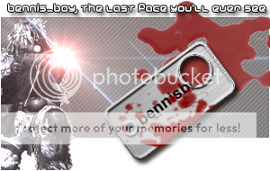
mope, the oy is there, it just got shotEntertayner wrote:
I don't like the size and I think you're missing a "oy"
lol I was putting a boarder on as you typed it i thinkRidir wrote:
just my opinion:
the text is good for your name, not good for the "quote." I like how you tried to go outside of the background but the BG need a border.
In PS go to blending options -> stroke -> pixels 1 -> color white (usually better for a darker website like BF2s)
Also I like the sniper but having him cut off kinda negates putting him past the border IMO. Do like the Lens Flare though. BG is kinda plain and boring too and much too close in color to the sniper and tag if you are going to leave it plain.
Last edited by bennisboy (2007-06-16 10:44:33)
Last edited by Ridir (2007-06-16 23:42:45)
http://forums.bf2s.com/viewtopic.php?id=77330Ridir wrote:
not to side track or anything but any comments on my new sig?
Yeah, I was trying to get it to look like a muzzle flash, couldnt really find any other effective way**|=5h@wN=|** wrote:
like the idea but lens flare is a no no in sigs. makes it look tacky. sry. like everything else tho gj!
Last edited by bennisboy (2007-06-17 03:00:10)
Last edited by Mekstizzle (2007-06-17 04:09:48)